


Keep Calm and Carry On. Learn to manage the volatility of cryptos
Glenn Lawrence writing from Ronda, Spain
It’s going to be OK, really.
A crypto crisis does not mean the demise of crypto. The crypto universe is not ending. But the collapse of prices and the industry crisis offers important lessons, especially to newcomers to investing and trading who don’t have experience in other markets that periodically experience crashes.
The volatility of crypto is exceedingly high relative to other tradeable assets making this crash especially painful. Learning to manage volatility is crucial to success. And applying the lessons learned provides dual, complementary benefits: avoiding substantial losses when prices are falling and putting volatility to work for you to take advantage of crypto’s outsized profit potential when prices rise.
And, of course, if you are willing to short the market, you can take advantage of volatility to capture outsized profits when prices are crashing. Some recent quotes put the current crisis into perspective.
For example, in a story in Fortune, Mark Cuban, a crypto evangelist, especially of Ethereum (he calls himself an Ethereum “maximalist”), refers to an apropos quote from Warren Buffet: “When the tide goes out, you get to see who is swimming naked.” And, no doubt, the current tide is exposing a lot of naked swimmers. Cuban says, “Disruptive applications and technology released during a bear market, whether stocks or crypto or any business, will always find a market and succeed.”
Bingo.
This vicious bear market is capitalism working at its best. The bear market is good old creative destruction at work. The lousy business models tying up too much capital must go. It’s a market-driven reallocation of capital to successful surviving business models and new, improved models.
Many influential pundits claim that cryptos are a sham or Ponzi schemes based on the greater fool theory. But I say “not so fast”—these are easy claims for crypto haters to make.
All assets become overvalued, such as conventional assets like stocks in 1929 and the U.S. housing market in 2007-2008. Those who buy “too high” also get exposed as “greater fools.”
The greater fool theory isn’t unique to cryptos. However, this train of thought leads to an interesting parallel. Remember the roaring “dot-com” days in late 1999 and early 2000? Forgive me, but most in the crypto space may be too young to remember that bubble.
This vicious bear market in cryptos reminds me of the bear market that followed the bursting of the dot-com bubble.
At the peak of the dot-com days, many were getting rich via IPOs with nothing much more than a business plan. Some were developing businesses that had just begun to generate sales but were not yet profitable.
For example, I have a friend who made millions via the IPO of a company that owned the twelfth-highest-ranked internet search engine. Who’s eager today to buy shares in an initial offering for the twelfth-highest-ranked search engine?
In another pertinent article, Rick Rieder, BlackRock’s chief investment officer of global fixed income, told Yahoo Finance Live, “You are seeing a lot of the leverage that was built up around crypto come unglued quickly. I still think Bitcoin and crypto are durable assets.”
Well said.
Market excesses are always a function of too much leverage and misallocated capital. Crypto as an asset class is here to stay. But much of the inefficiencies and excesses need to be cleared out.
It’s unfortunate, though, that the high amount of price volatility in cryptos makes this crucial period of creative destruction so painful. That’s a hard lesson for less experienced crypto investors and traders who haven’t lived through a bear market like this one.
That’s where Sovereign X’s SX Wealth comes in. You don’t have to lose your lunch riding the intolerable rollercoaster of crypto volatility.
SX Wealth’s philosophy is to play it smart; you don’t have to subject yourself to horrendous levels of volatility, and the corresponding doubt and anguish, to participate in crypto. Consider a lesson learned (usually the hard way) by the best traders of all time. Rule No. 1 in successful trading is to “cut your losses.”
Markets don’t always cooperate—it’s guaranteed that a market will viciously turn around on you at some point. Capital preservation is key. You have to protect your capital to take advantage of future opportunities. (For more of our guidance on successful trading practices, please refer to our user guides on the website.)
Beware that going “all in” on crypto in the past might mean getting blown up today. Please don’t do it.
Many leading cryptos with legitimate and productive business models have fallen 90% from their peak value in just over half a year. No one should have to endure that kind of risk, witnessing a 90% decline in the value of an investment. So how do you avoid painful downside volatility while preserving your ability to take advantage of bull markets?
First, you need guidance on when to step aside to avoid excessive risk and then when to step back in when conditions are favorable. That’s where SX Wealth | Crypto comes into play. We provide a variety of time-tested and proven models, many of which we have enhanced with our volatility adjustment technology, and we offer an objective synthesis of all of our models’ signals, so there’s no question about whether to buy or sell or how much capital to allocate.
Here’s an example.
Long-time subscribers are aware of our Buy and Sell Gauges. These gauges measure the aggregate of our trend models’ uptrend and downtrend signals. For instance, if all models signal an uptrend, the Buy gauge reads 100%. If half are signaling an uptrend, the Buy gauge reads 50%, and so on.
To show how well these signals have worked using our historical data, we are pleased to introduce historical charts focusing specifically on gauge readings. Subscribers can now find three related charts on their dashboard to view the history of all of our models: buy signals from our Buy Gauge, sell signals from our Sell Gauge, and a chart that aggregates signals from both gauges. A relevant example for today’s discussion is presented below.
The chart of BTC’s Sell Gauge shows the daily price series of BTC in the upper chart window and the daily reading of BTC’s Sell Gauge in the lower window. When the gauge indicator is at 0, our models are not signaling a downtrend. And when the gauge indicator is at its maximum of 10, it means all of our trend models signal a downtrend. A conservative approach to using SX Wealth’s gauges? Act when the indicator is at 7 or higher (which equates to a 70% reading on a gauge).
Notice that the chart has a purple horizontal line marking the 7 threshold.
After BTC failed to rally in April 2022, the market entered the current leg of the longer-term downtrend. Notice that in late April, our BTC Sell gauge rose to 7 (marked with the red arrow), and ever since that date, the gauge reading has been between 7 and 10. A reading of 7 or above is considered “strongly bearish.” So why endure the pain of watching BTC lose almost half its value when by following our signal you could have been sitting in the safety of cash, preserving your capital for the next time our models turn bullish (as they inevitably will)? 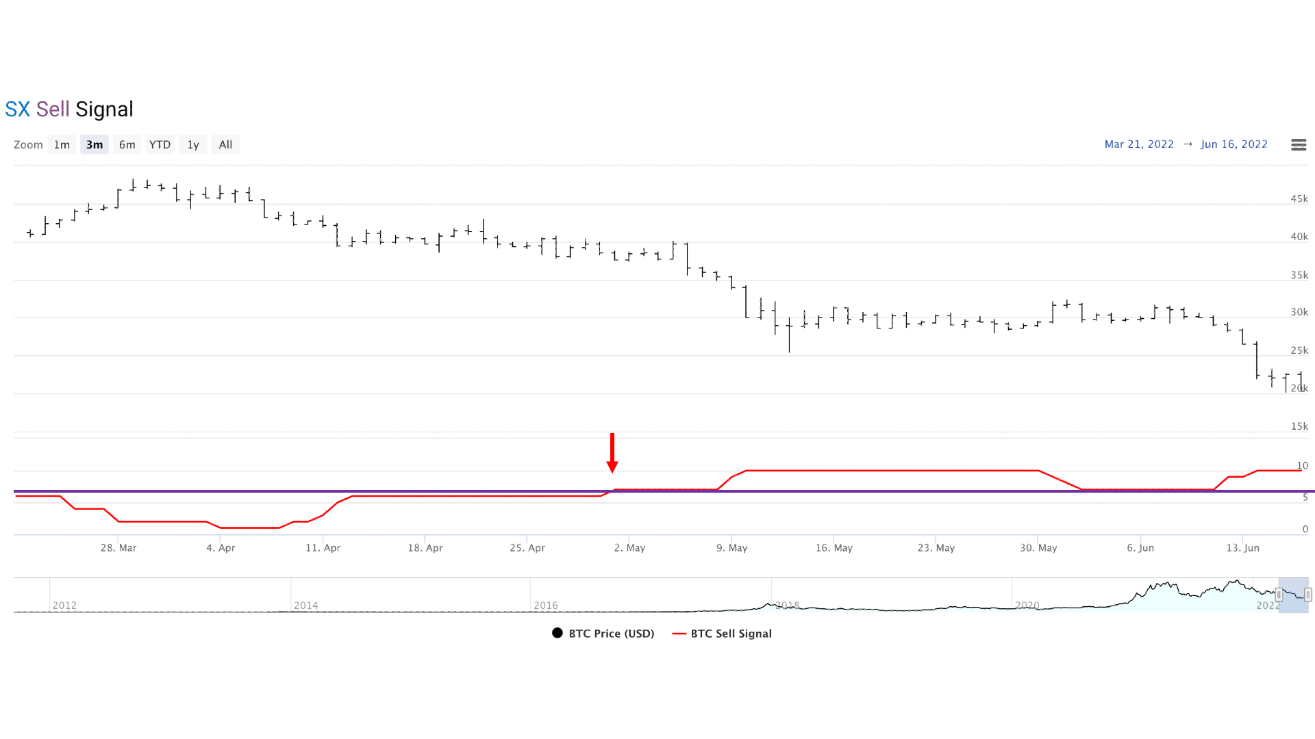 We invite you to view the history of our signals from our Buy and Sell gauges using these charts by signing up for a risk-free 60-day trial subscription to SX Wealth | Crypto. Your password-protected dashboard will provide you access to see how our signals have accurately reflected crypto market trends, specifically Bitcoin’s movements, both up and down.
____________________________________________________________________
L. Glenn Lawrence is co-founder and managing partner of SX Wealth.